|
Processing: Before and After From time to time I got questions about the processing of my pictures so I created this page to give you an idea of what it can look like. First of all I try to get a decent lit RAW image. Checking the histogram on camera helps a lot. Better to get a flat looking RAW than to have blown out highlights or missing details in blacks. My processing starts in Adobe Lightroom (free alternative: Darktable) and ends up in Photoshop (free alternative: GIMP) to create the watermarks, border and the webgallery. For some of the last steps I created simple Photohop scripts. The adjustments can be just small changes in color and contrast or really strong modifications. Here are one sample of each gallery in 2020 up to 1st of May: Note: - the "unprocessed" images are cropped and RAW-converted with some standard settings (sharpening, noise reduction, compression, size, ...). - the "processed" images are out of lightroom and have added watermarks in photoshop. Comments, Questions, Proposals, Suggestions Appreciated! |
||||
for lighting I refer you to Gallery 206 and the comments there (this is just a small overview): |
||||
| comment | unprocessed | processed | ||
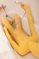
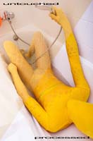
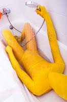
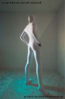
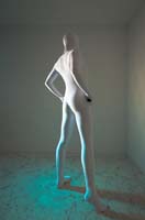
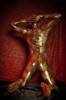
| Gallery 247: The inital RAW images are quite flat and I did a lot of adjustments to get a colorful and strong contrast. Also I changed the white balance to a more blueish tone and adjusted the yellow color back to a nice warm tone. Pictures from my bathroom are always tricky. |
 |
 |
 |
|
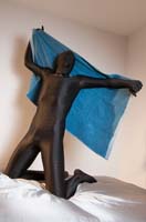
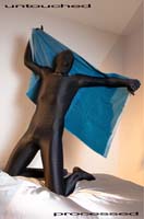
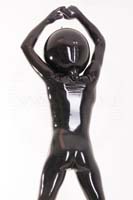
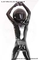
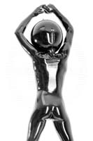
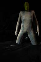
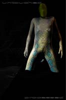
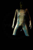
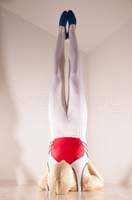
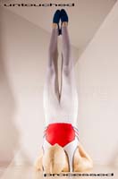
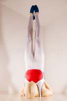
| Gallery 248: These images were quite nice out of cam. The main adjustments were in the levels and curves to enhance the tonal values on the suit. Increasing the color saturation and small adjustments on white balance did the rest. |
 |
 |
 |
|
| Gallery 249: My focus here were to increase the details of the fabric. Small adjustments can make huge differences. Some warm color added to the hightlights of the images. |
 |
 |
 |
|
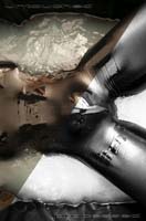
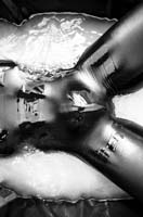
| Gallery 250: A lot of adjustments in Lightroom to enhange the details on the suit, converted to grayscale. A lot of time for retouche jobs in Photoshop to reduce dust and dirt. |
 |
 |
 |
|
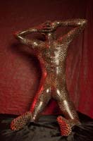
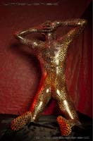
| Gallery 251: The adjustments in this gallery are stronger. Focus were on darken the black background (I removed bright areas on the sheet in all images with a black brush) and to push the colors of the suit to become eye-catchy. The green zentai (head) got even darker but that was OK for me. |
 |
 |
 |
|
| Gallery 252: Converted to black and white, a lot of adjustments at the tonal curve. Highlights and darks compressed. Strong noise reduction. |
 |
 |
 |
|
| Gallery 253: Images out of cam were a bit flat. White balance, highlights/shadows, saturation, tonal curve adjusted. Yellow color on the suit increased to stick out of the background. Vignette added. |
 |
 |
 |
|
| Gallery 254: The RAW files looked quite nice out of cam. Some adjustents on color, mid tone curves and to reduce vignetting. |
 |
 |
 |
|
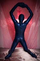
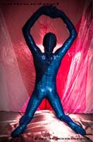
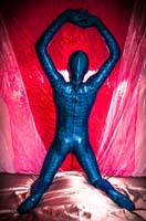
| Gallery 255: RAW material from this set varied quite a lot. Some images where very dark, others where brighter. After level all images to a similar brightness, the focus were on a big color contrast between the blue suit and the red background. You can see the white part of the background got reddish and the dark blue more towards cyan. |
 |
 |
 |
|
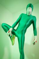
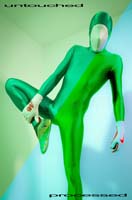
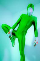
| Gallery 256: The images were really nice out of cam. The green gel on the flash did greate a good tone-in-tone effect but I wanted to have a stronger separation between the suit and the background. White balance, color adjustments, blueish coloring on the hightlight, tonal curve settings were made to get the final result. Unfortunately I lost some details on the suit. |
 |
 |
 |
|
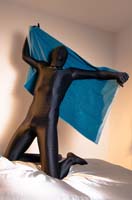
Please sign in my Guestbook!  I need your feedback!
|
||||
|
-Back to the galleries- |
||||